document updated 1 year, 9 months ago, on Sep 10, 2023
lettering guide lines
This page explains it pretty well.
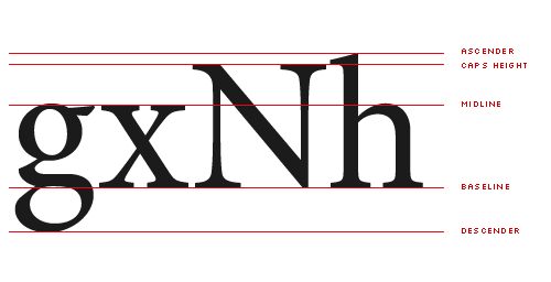
The most important lines are:
- baseline — the bottom of all letters that don't have any descenders
- mean line or x-height — the tops of regular lower-case letters, such as 'x' and 'e'
- ascent line— the tops of letters that have ascenders, such as 'k' and 'h'
- note that the cap height may be slightly different than the ascent line, however I usually make them the same for hand-lettering
- descender line — the bottom of letters that have descenders, such as 'y', 'g', and 'p'
Additionally, if you have multiple lines of text, you'll want to know the leading, that is: the amount of space between the lines of text.
